If you’ve ever looked at a stock or crypto chart, chances are you’ve seen candlesticks—those green and red bars with little “wicks” sticking out at the top and bottom. At first, they might look confusing, but candlesticks are one of the most powerful tools for traders because they tell a complete story about price action in a single glance.
What Is a Candlestick?
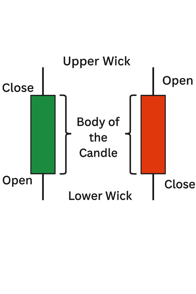
A candlestick represents price movement within a specific time frame—whether that’s one minute, one hour, or one day. Each candle shows you four key pieces of information:
- Open: The price at the beginning of the time period
- Close: The price at the end of the time period
- High: The highest price reached during that period
- Low: The lowest price reached during that period
In other words, a candlestick is like a mini-summary of everything that happened to an asset’s price in a set amount of time.
Breaking Down the Parts of a Candle
- The Body: The thick rectangular part of the candle, which stretches from the opening price to the closing price. If the candle is green, the price closed higher than it opened (bullish). If it’s red, the price closed lower than it opened (bearish).
- The Upper Wick: The thin line above the body, showing the highest price reached.
- The Lower Wick: The thin line below the body, showing the lowest price reached.
Together, these parts give traders quick insight into market sentiment—whether buyers or sellers were stronger during that period.
Why Candlesticks Matter
Unlike simple line charts, candlesticks pack a lot of detail into a single visual. By looking at just a few candles, you can see:
- Whether momentum is shifting up or down
- How volatile the market is
- Where price rejections (support or resistance levels) might be happening
That’s why traders all over the world—from Wall Street to crypto exchanges—rely on candlesticks to make faster, more informed decisions.

Leave a comment